Logo Usage
Here are some important guidelines for using the Thunderkick logo. For any questions, please contact: marketing@thunderkick.com
Main logo. Should be used in most situations. Available in white or black
On rare occasions when the name in the main logo gets too small compared to other company logos in lists for example, the horizontal logo could be used instead to make sure our name is properly visible.
Horizontal logo available only in white or black.
For small sizes/containers
In very small sizes for print or screen there is a special logo that should be used to make sure our name is more readable.

Main logo should use small versions in sizes from:
Print: 27mm – 15mm height
Screen: 80px – 42px height
Horizontal logo should use small version in sizes from:
Print: 5mm – 3mm height
Screen: 20px – 15px height
Make our logo stand out
Use empty space around the logo to make it stand out. Don’t put information too close to the logo as it will get lost in the visual information.
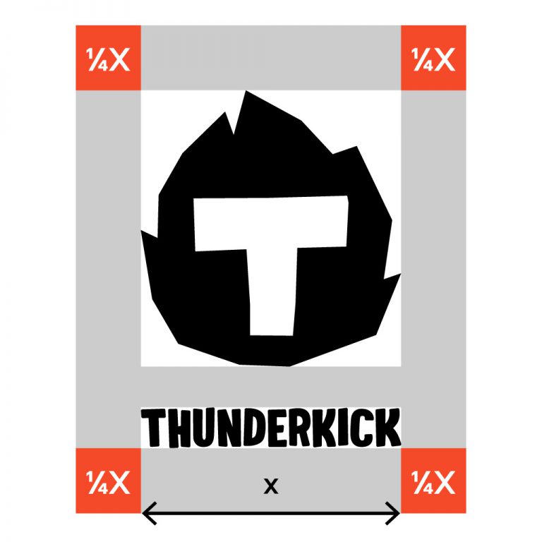
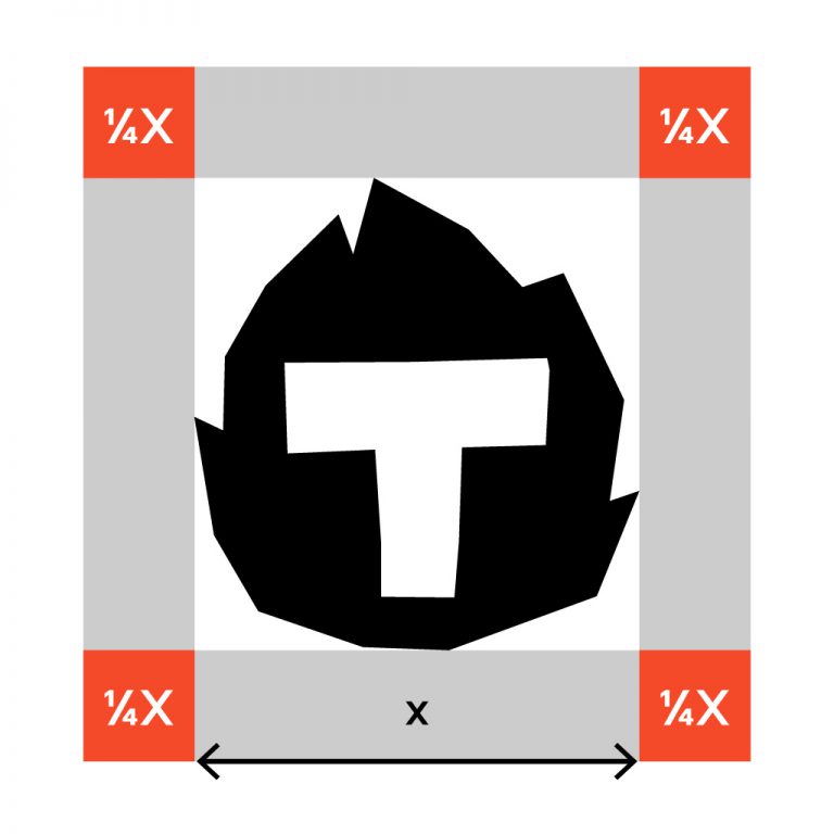
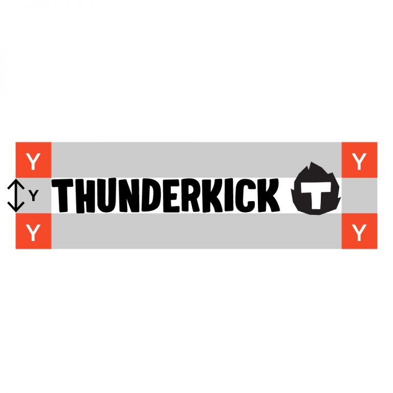
This is how you calculate proper margins. These margins are the minimum amount of empty space required.
Avoid

Downloads
