Brand identity assets
This is our Style guide. It allows us to tell a powerful story and help bring the Thunderkick brand to life.
Our brand
We are Thunderkick and we make games. We love bold ideas, color and loads of fun. Our strategy is to create kick-ass content that leaves no one untouched.
Mood adjectives: Quality, Colorful, Fun, Bold, Likeable and Caring.
Logo
Logo
Our logo is our flag. It represents us and unites us. And when we use it the right way, people can spot us at a glance.
Symbol. When there is no doubt that Thunderkick is the provider/sender of the content, the symbol can be used by itself. Available only for internal use in white and black and may be colorized with our prime colors or gradients.

Symbol. When there is no doubt that Thunderkick is the provider/sender of the content, the symbol can be used by itself. Available only for internal use in white and black and may be colorized with our prime colors or gradients.
Horizontal
On rare occasions when the name in the main logo gets too small compared to other company logos in lists for example, the horizontal logo could be used instead to make sure our name is properly visible.
Horizontal logo available only in white or black for external use. For internal use it can be colorized with our prime colors or gradients.
Logo
For small sizes/containers
In very small sizes for print or screen there is a special logo that should be used to make sure our name is more readable.

Main logo should use small versions in sizes from:
Print: 27mm – 15mm height
Screen: 80px – 42px height
Horizontal logo should use small version in sizes from:
Print: 5mm – 3mm height
Screen: 20px – 15px height
Logo
Make our logo stand out
Use empty space around the logo to make it stand out. Don’t put information too close to the logo as it will get lost in the visual information.
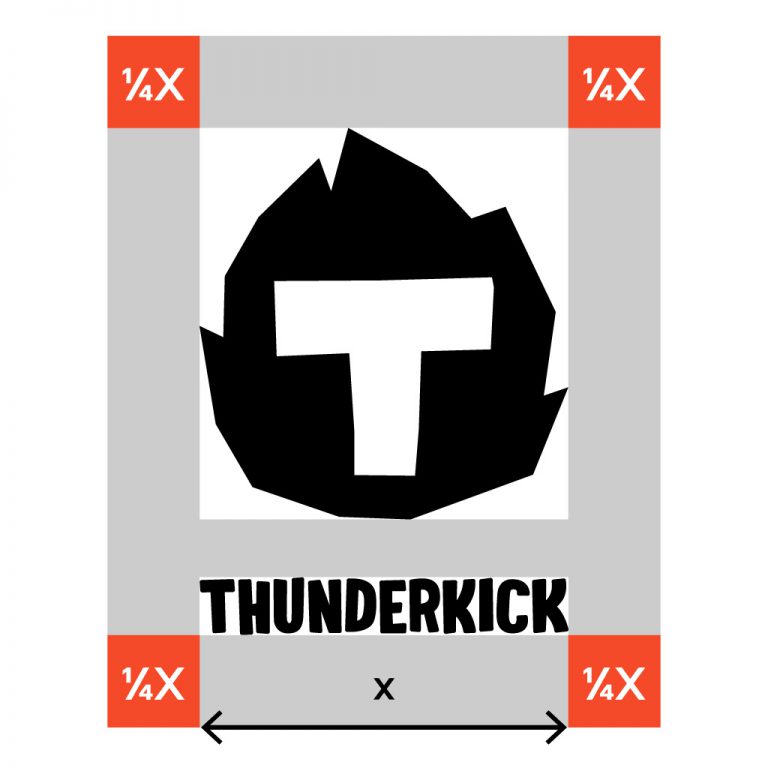
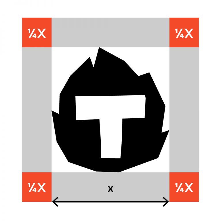
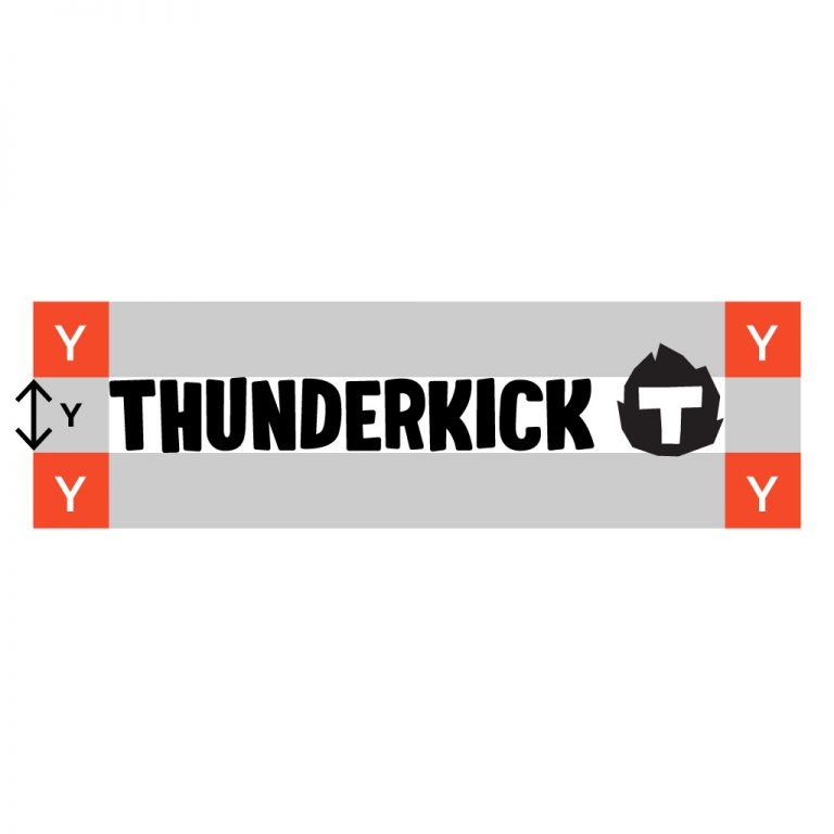
This is how you calculate proper margins. These margins are the minimum amount of empty space required.
Logo
Avoid
Logo
Logo with colors and gradients
Works in all our prime colors
Our logo can be used in all our prime colors. Our logo can also be used on colored backgrounds. For best effect use bright colors on dark background.
Gradients for energy
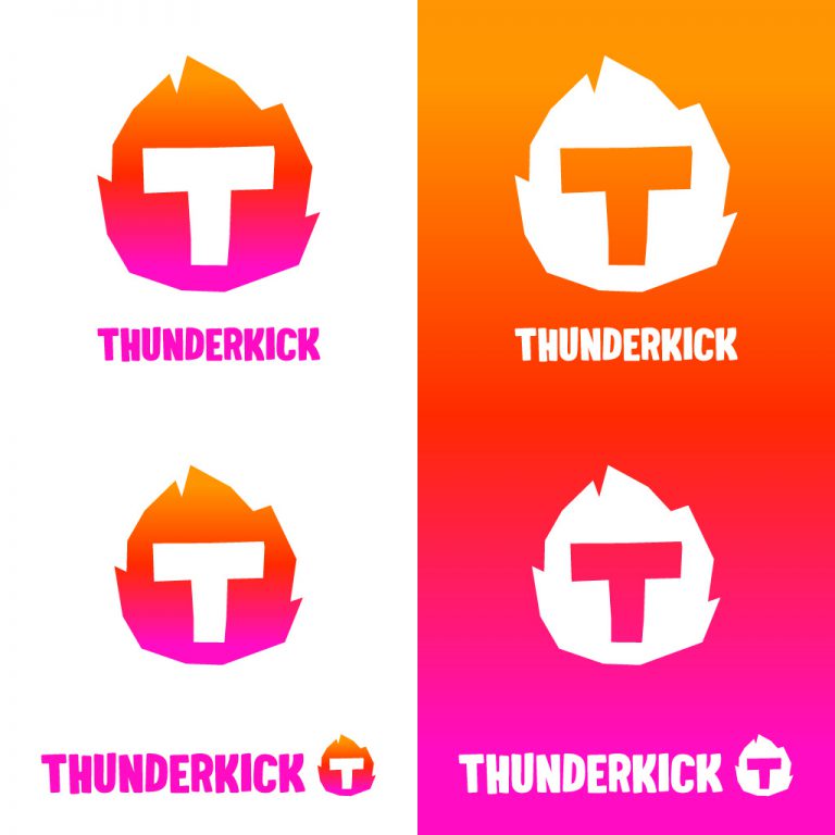
When coloring logo in gradient the text part must be a solid color to keep readability. Use our prime colors in gradients for energy.
Please be cautious
Don’t use gradients in separate logo details and don’t use gradient logo in combination with a gradient or patterned background. If the background is busy we need the logo to stay clean as a contrast.
Don’t gradient separate details.
Don’t stack gradient on gradient.
Logo
Logo with patterns
Logos can be used with patterns but with caution. Make sure that contrast and readability is intact if you are using it. When using a pattern to fill the logo the text part must be a solid color to keep readability.
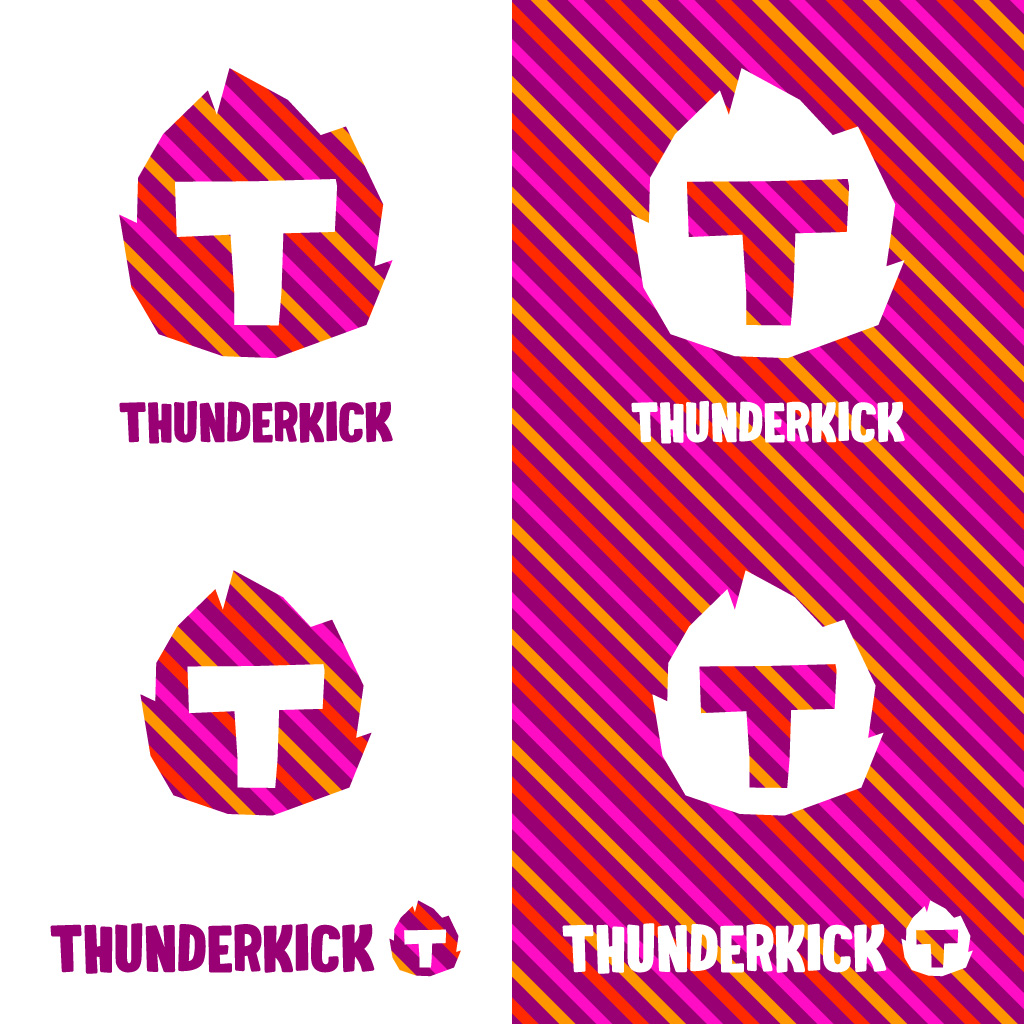
Please be cautious
Don’t use patterns that breaks up the clarity and readability of the logo.

Example 1 – bad readability.
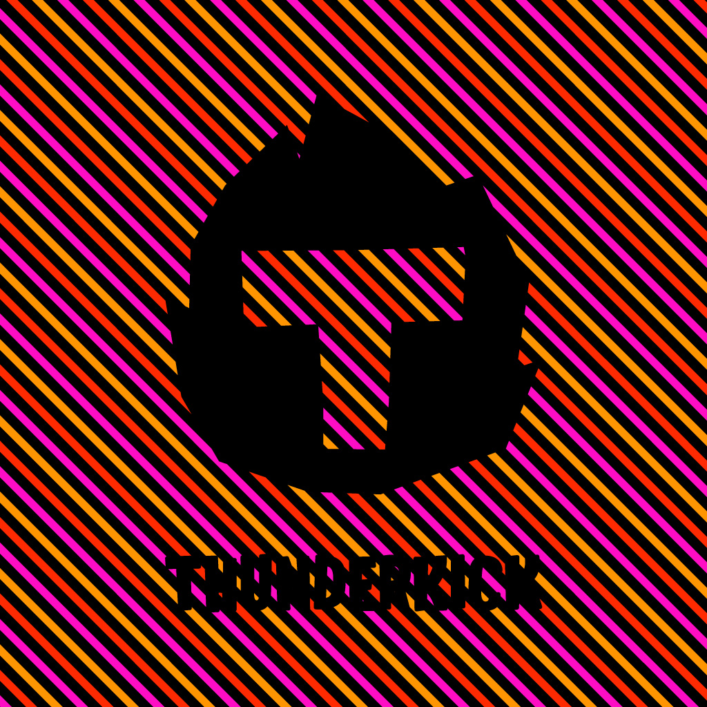
Example 2 – bad readability.
Logo
Logo with photos
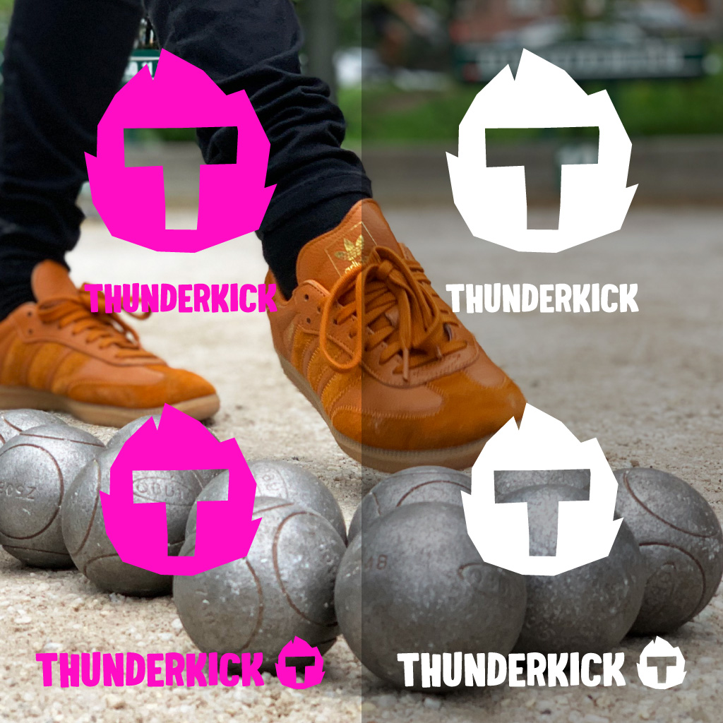
Logos can be placed on photos. Make sure that contrast and readability is intact if you are using it. You might need to colorize or darken/lighten parts of the photo to make sure the logo is clearly visible/separated from the background. Don’t add outlines or elements to the logo to make it readable, instead find a better placement within the photo or manipulate the photo in a way that produce the optimal result.
Colors
We. Love. Colors.
Our color palette enables us to be playful and communicate with energy. The palette consists of a carefully chosen set of colors that are drawn from key areas of the color spectrum and move from rich to vibrant.
Primary
Use prime colors as much as possible in RGB for screen and PMS/CMYK for print.
#000000
CMYK: 100, 40, 0, 100
PMS: PBlack6C
#FFFFFF
CMYK: 0, 0, 0, 0
#9B0DFF
CMYK: 67, 86, 0, 0
PMS: P527C
#00FFFF
CMYK: 67, 0, 23, 0
PMS: P319C
#0080FF
CMYK: 100, 40, 0, 0
PMS: P3005C
#A9FF00
CMYK: 50, 0, 100, 0
PMS: P375C
#FF9500
CMYK: 0, 48, 93, 0
PMS: P2013C
#FF2A00
CMYK: 0, 89, 90, 0
PMS: P3556C
#FF0DC4
CMYK: 12, 91, 0, 0
PMS: PRhod. redC
#FFF600
CMYK: 2, 0, 97, 0
PMS: PYellowCP
Secondary
And supplementary variations of prime colors as secondary colors. Can be used for contrasting elements within the same shade of color or for text or darker backgrounds etc.
#400030
CMYK: 53, 100, 37, 61
PMS: P5115CP
#003B40
CMYK: 100, 50, 49, 48
PMS: P3165CP
#E5FFB3
CMYK: 17, 0, 39, 0
PMS: P373C 60%
#D4FF80
CMYK: 28, 0, 61, 0
PMS: P373C
#659900
CMYK: 66, 25, 100, 9
PMS: P370C
#2A4000
CMYK: 78, 48, 100, 54
PMS: P574CP
#FFFDB3
CMYK: 0, 0, 29, 0
PMS: PYellowCP 30%
#FFFB80
CMYK: 1, 0, 63, 0
PMS: P106CP 80%
#998500
CMYK: 29, 36, 100, 17
PMS: P112CP
#403700
CMYK: 43, 50, 95, 45
PMS: P133C
#FFE0B3
CMYK: 0, 17, 45, 0
PMS: P135C 60%
#FFCA80
CMYK: 0, 27, 73, 0
PMS: P135C
#995A00
CMYK: 26, 56, 100, 19
PMS: P146C
#402500
CMYK: 39, 66, 82, 56
PMS: P161C
#FFBFB3
CMYK: 0, 39, 29, 0
PMS: P170C 60%
#FF9480
CMYK: 0, 61, 48, 0
PMS: P170C
#991500
CMYK: 21, 100, 100, 15
PMS: P7622C
#400A00
CMYK: 37, 96, 68, 61
PMS: P7631CP
#FFB3EA
CMYK: 0, 39, 3, 0
PMS: P210CP 80%
#FF80DF
CMYK: 10, 64, 3, 0
PMS: P231C
#990074
CMYK: 51, 100, 20, 14
PMS: P2425C
#DFB3FF
CMYK: 17, 37, 0, 0
PMS: P2562C 90%
#CA80FF
CMYK: 37, 56, 0, 0
PMS: P528C
#5B0899
CMYK: 78, 100, 0, 0
PMS: P2607CP
#250040
CMYK: 89, 100, 34, 30
PMS: P2627C
#B3DAFF
CMYK: 34, 0, 7, 0
PMS: P2975C 75%
#80C0FF
CMYK: 57, 1, 4, 0
PMS: P2985C 90%
#004A99
CMYK: 100, 68, 18, 5
PMS: P2945C
#002040
CMYK: 100, 80, 45, 46
PMS: P7463C
#B3FFFF
CMYK: 29, 0, 12, 0
PMS: P317C 80%
#80FFFF
CMYK: 49, 0, 18, 0
PMS: P318C
#008D99
CMYK: 100, 12, 42, 4
PMS: P321C
Color profile
Use the correct color profile – to make sure our graphics look consistent at all stages and across computers/producers. Color profile in RGB documents should be – sRGB iec61966-2.1. Color profile in CMYK documents should be – Coated FOGRA39 (or print company’s own)
Adobe swatches
Get an easier workflow in Adobe Illustrator and Adobe Photoshop by downloading our color palette as swatches. RGB and CMYK palettes are included.
Colors
Gradients
We use gradients to bring sense of movement and life through color. Use gradients that feel dynamic. A gradient that spans across three colors can look more dynamic than using only two colors. When picking colors, don’t jump back and forth in the spectrum, always chose one direction and stick to it.
Font
Nudica
Nudica is our Thunderkick brand font. It’s easy to read anywhere. Use it everywhere. Even on that notice about the ping-pong tournament 🙂
Space Mono
Space Mono is our Thunderkick brand font. It’s easy to read anywhere. Use it everywhere. Even on that notice about the ping-pong tournament 🙂
Web
Web
Specific rules applies for the web. In this section, we address fonts, colors and buttons.
Font Heading – Nudica
Aa
H1
50px Bold
H2
36px Bold
H3
24px Bold
Tone of voice
tone of voice
No one wants to be friends with a logo. To create a deeper bond and build relationships we need to have a strong brand voice that gives people a sense of who we are and what we stand for.
When we write copy we are:
- Caring & respectful
Always speak to our customers, partners and coworkers in a familiar, warm, and accessible way. - Upbeat & passionate
Make it clear that we truly love what we do. - Fun & entertaining
Feel free to be funny when it’s appropriate. Our sense of humor is kind and slightly eccentric. We can be weird but not inappropriate. We prefer winking to shouting. - Slightly rebellious
We dare to stand out. We´re smart but never condescending.
Examples of texts
Published in our social media channels:
“Hello network! We’re back from our 2 weeks snooze fest and more excited than ever to Thunderkick-start a new year of fun. Hold onto your pants, it’s going to be a wild one!”
“Romanians – your prayers have been answered! We’re extending our slot reach, now offering our games to operators at the Romanian market.”
“How do you say compliant in German? No idea 😊 But here we are ready to support the new German regime from 30th of September.”
Photo
Photo
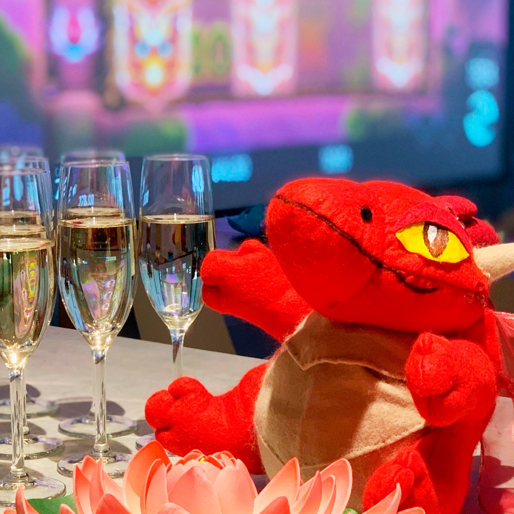
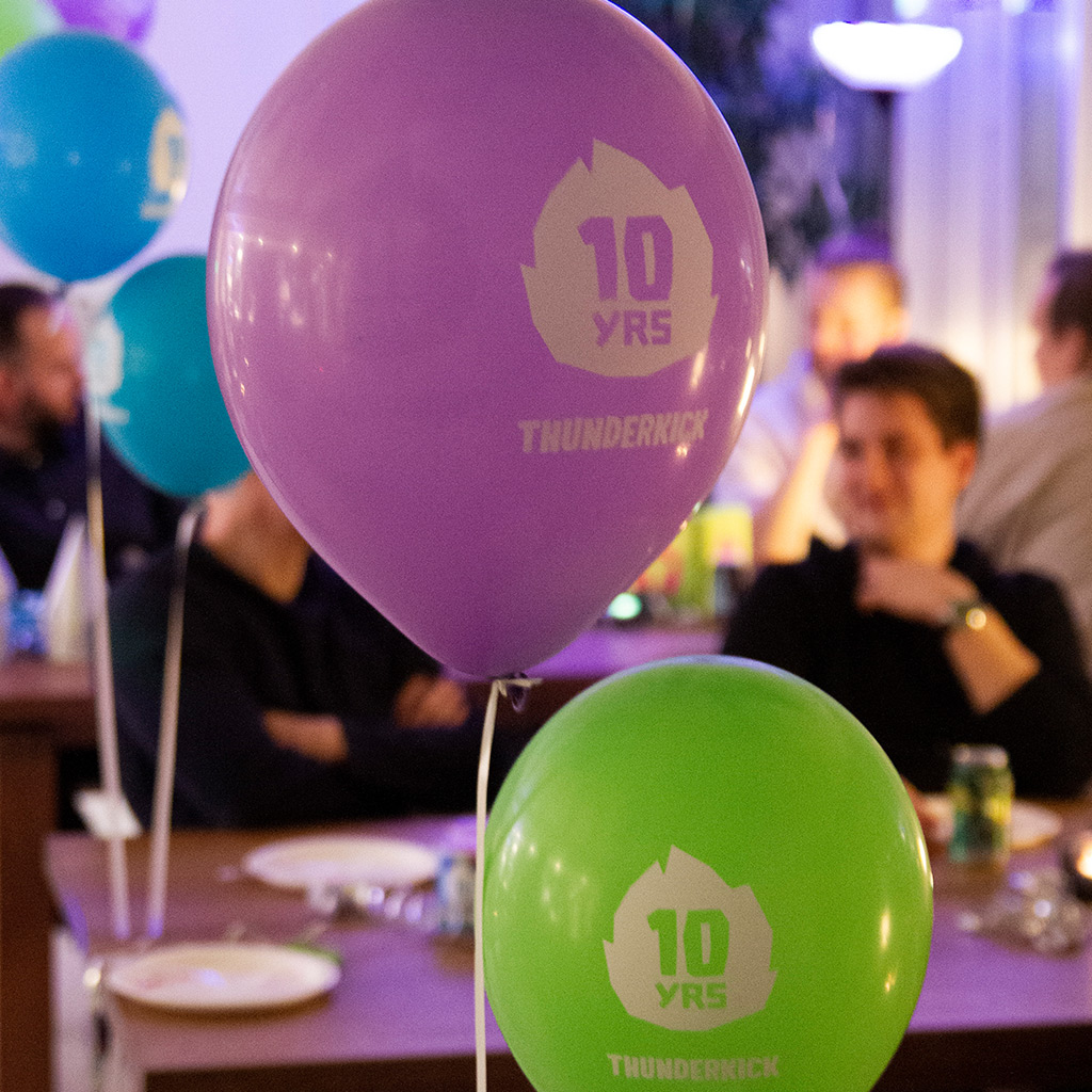
Our photography should show fun, friendship and express creativity. The emphasis should be on capturing moments of connection and playfulness. The focus should be on mood and emotion rather than people.
Keywords: Colorful, Light, Warmth and Positivity.
Include employees to create a warm, living atmosphere (for example their hands, legs or hair). Capture real moments that are not staged or fake.
Capture the mood but not the faces
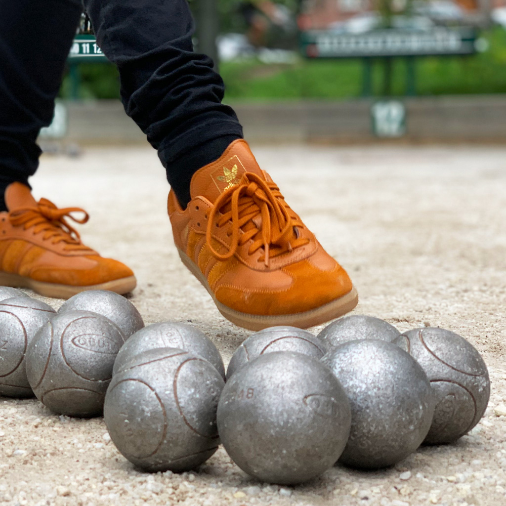
No faces of our people are allowed.
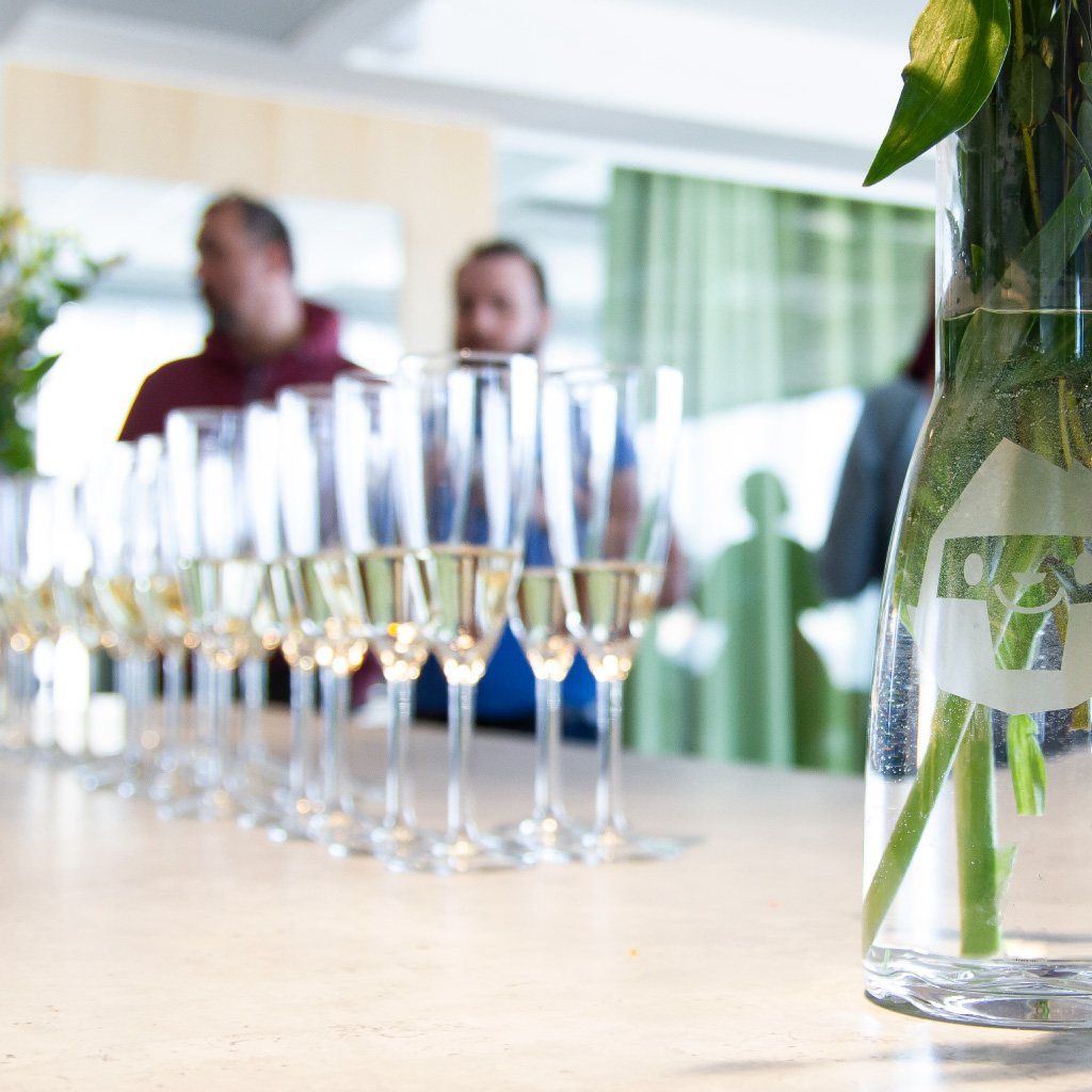
Blur faces, or have people faced away.
Photo
Moodboard – direction
Technical details
Format: 3510x2490px minimum
File type: JPG
Resolution: Maximum
Color space: sRGB

Patterns
patterns
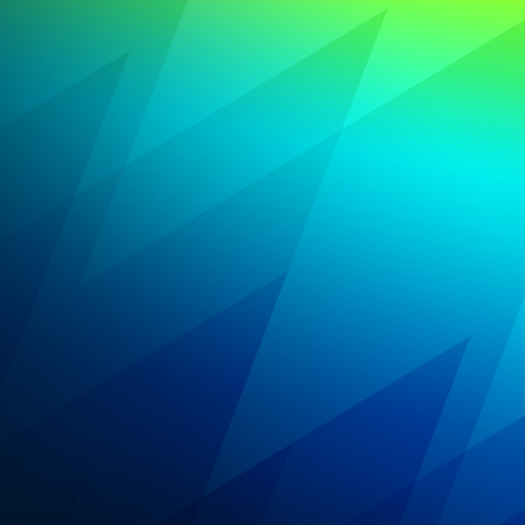
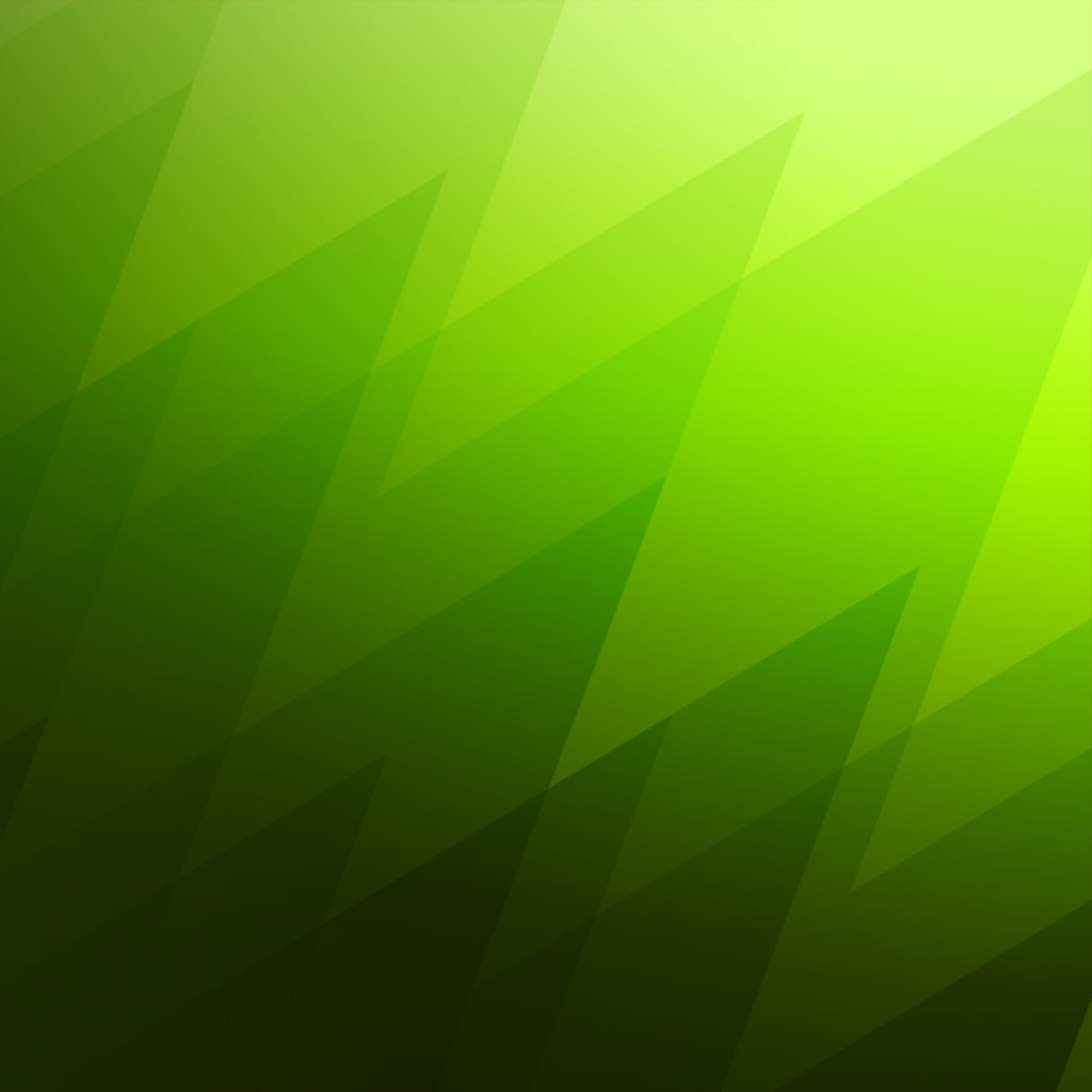
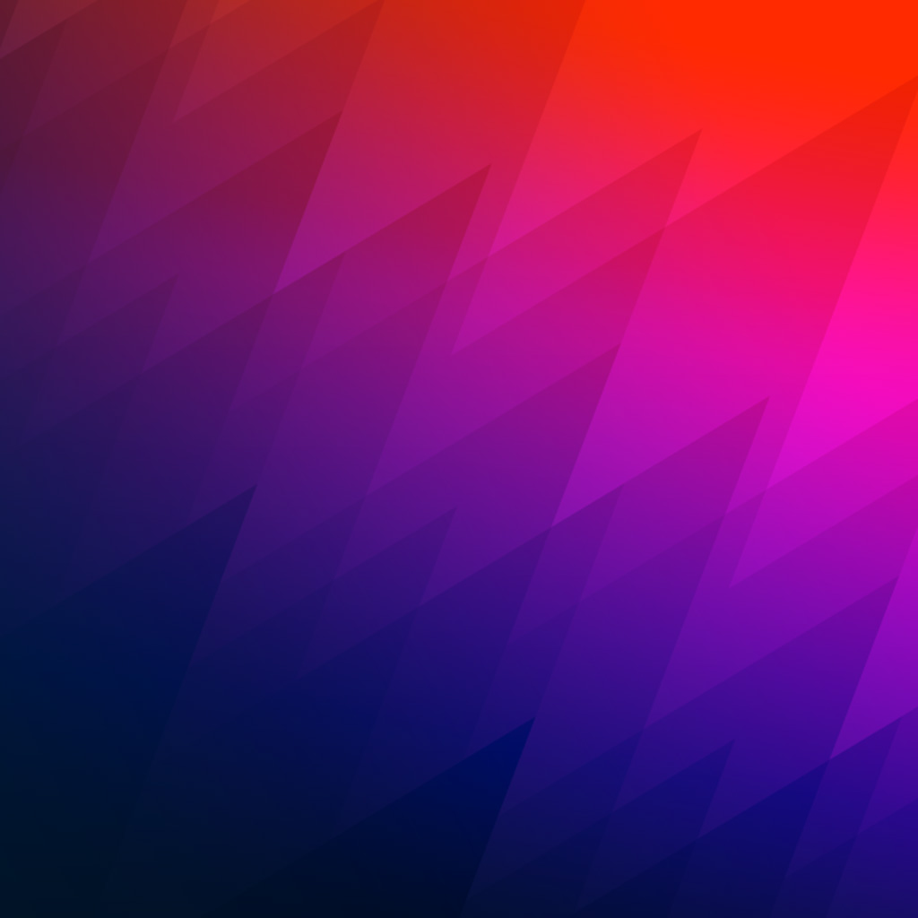
Background patterns should feel dynamic and create a sense of speed/action. We want a movement from dark to light in a direction upwards.
Banners
Banners
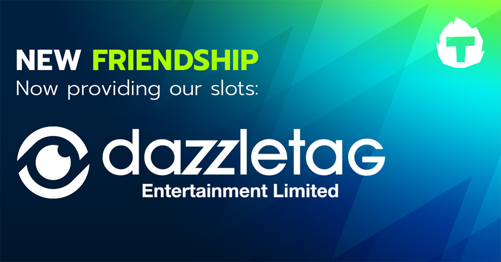

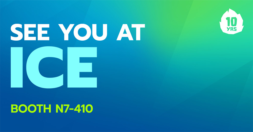
- Text shows up better against a darker backdrop. The ration of dark space to light space are optional – use what is best for the situation.
- We colorize text and words in text with our prime colors to stand out from the background. Sometimes we add a glow to details to simulate a lightsource. Nickainlay may be used together with Prompt to create contrast.
- Text is usually aligned to the left.
- We want text to be short and “in tonality” with the rest of our texts.
- Patterns use a similar scale within similar type of banners but can be rotated and scaled to taste.
- Our logo or symbol should be placed in top right corner.
Banners
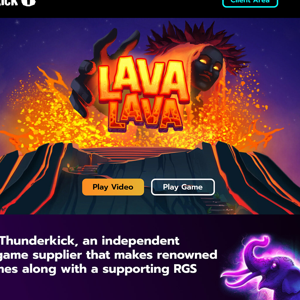
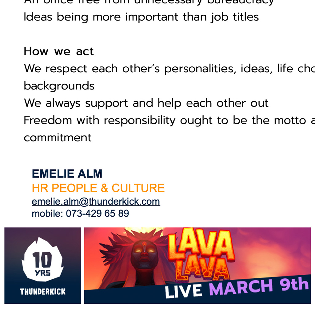
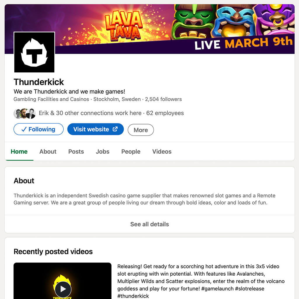
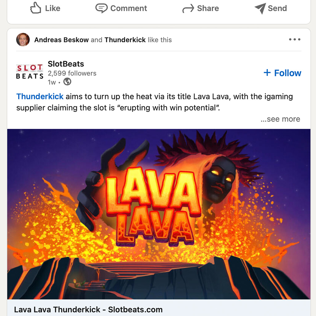
Game banners
To promote our games we need a variety of banners that will be used both internally and externally. The assets need to be delivered 2 weeks after certification at the latest.
Videos
Videos
Our videos should be made for 1920x1080px size with 60fps. Saved in YouTube 1080p full HD format.
Promo video
The promo video should present the most interesting features and the theme of the game in an interesting fashion.
Screencapture gameplay with a setting of bet 10 in €. In Bandicam use MPEG-1 (VBR), full size 60fps, 100q for video settings and PCM 48KHz for sound settings.
Runtime up to 1min.
Promo teaser
For the promo teaser try to convey the game theme with the help of game logo, copy and music. Keep promo teaser short and to the point.
Runtime up to 30sec.
Videos
Showreel
The showreel should showcase a selection of our games at special events.
Always start our showreel with a logo title card.
Only use content made for 1920x1080px size in 60fps. The finished showreel should be in YouTube 1080p full HD format.
Videos
Banner video
Animated banners used for marketing should keep a common expression.
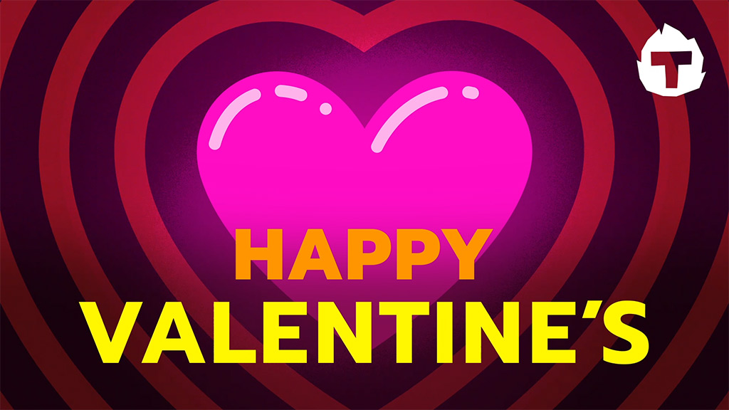
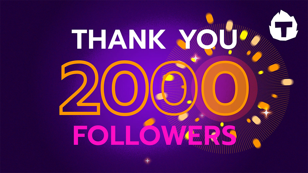
- Our logo or symbol should be placed in top right corner.
- Use a flat stylised and colourful illustration on a darker background.
- Avoid detailed and complex illustrations or graphic items.
- Length should be kept under 20 — 30sec.
- Use bold and contrasting colors on text.
Events
Events
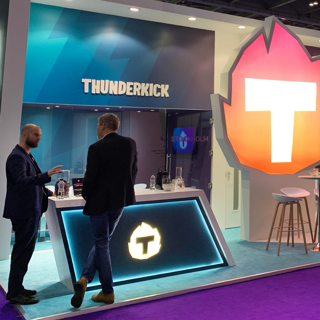
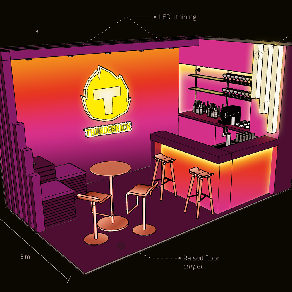
When displaying our business at the industry events, the Thunderkick brand should be exposed at its best. The advantage of playing with patterns and a full color palette are to be used at its fullest potential. We add various light effects, gradients and different surface materials to create a likeable but professional impression.
The theme of the stand designs and any branded items attached to it, differs from year to year. This is to create a buzz among the customers and to show the fun, likable and bold approach we want to give.
The logo is our flag and we wave it proudly at the exhibitions! The logo should be highlighted with colors, gradients, lightning effects, different sizes, heights or moving elements to make it stand out.
See rules for logo.
The floorplan and details of the exhibition stand are carefully designed to be inviting and perceived welcoming to our visitors. The stand space is meant to be an appealing environment for doing business as much as a hang-out place were to chill in between meetings.
Merchandise
Merchandise
Thunderkick branded merchandise should reflect the Thunderkick brand and match our vision of being bold, fun and likeable.
Our merchandise should “pop-out” from the crowd and generic items should be avoided.
Quality goes before quantity and we want to create a buzz among customers with the “less is more” approach.
Any merchandise for external and internal use should follow the branding guidelines specified in the Style Guide. Always check off with the Communications Team before placing an order.
